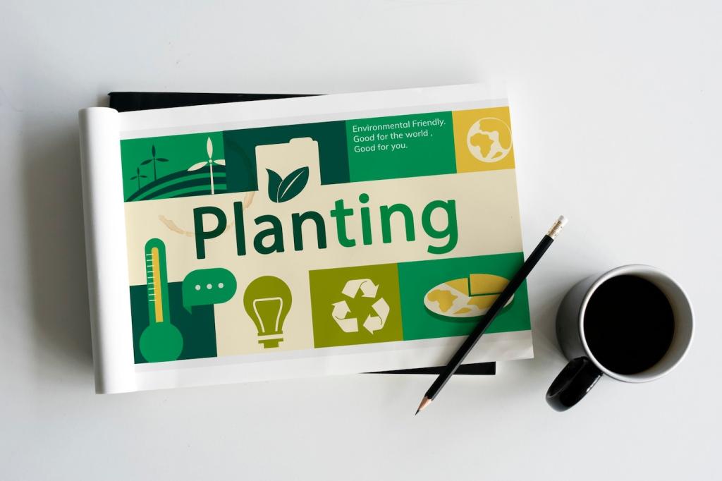

Design Principles for Green Messaging
Greens and earth tones signal nature, while blues communicate trust and water. Use high-contrast, color-blind–safe palettes so information remains accessible. Limit your palette to improve recall and reduce visual noise. Comment with palettes that worked for you.
Design Principles for Green Messaging
Choose highly legible typefaces and create a clear hierarchy: headline insight, supporting stat, actionable step. Lightweight files and crisp vector text load faster, saving bandwidth and attention. Want a typography checklist? Subscribe and we’ll send it.